Wow, this past week we hit 1 year in our home! Time flies! I still think of it as our “new” home, but now that we’ve lived here a year I should probably stop saying that.
Although there are still many projects we want to do around our home and yard, it is really fun looking back at where we started. Comparing the before and after pictures, it is crazy to see how much progress we have made so far! We moved (from our little condo in Seattle) with almost no furniture and decor, so, in an effort to be thrifty and budget-conscious, our home has slowly transformed into its current state.
For those of you who love and appreciate before and after pictures as much as I do, then here are some comparisons of the different spaces in our home. I’m also including some listing pictures because I think it’s neat seeing how much we have made this house our home, compared to someone else’s.
Looking at these pictures makes me so very grateful for our home–that it is a safe, peaceful, and happy place for our little family.
(This page contains affiliate links that I may be compensated for. Your clicks and purchases help support The DIY Lighthouse at no extra charge to you. I only put links to products I love and would recommend anyway.)
The Entryway
For Sale Picture
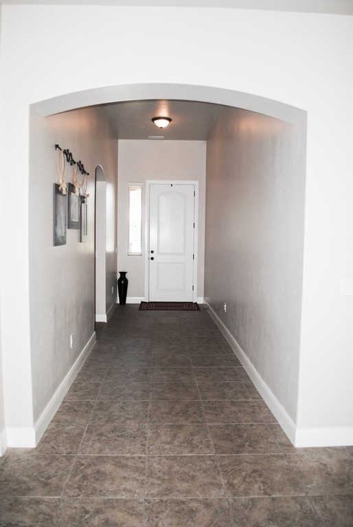
Here is what the entryway looked like online when the house was for sale.
Before Pictures
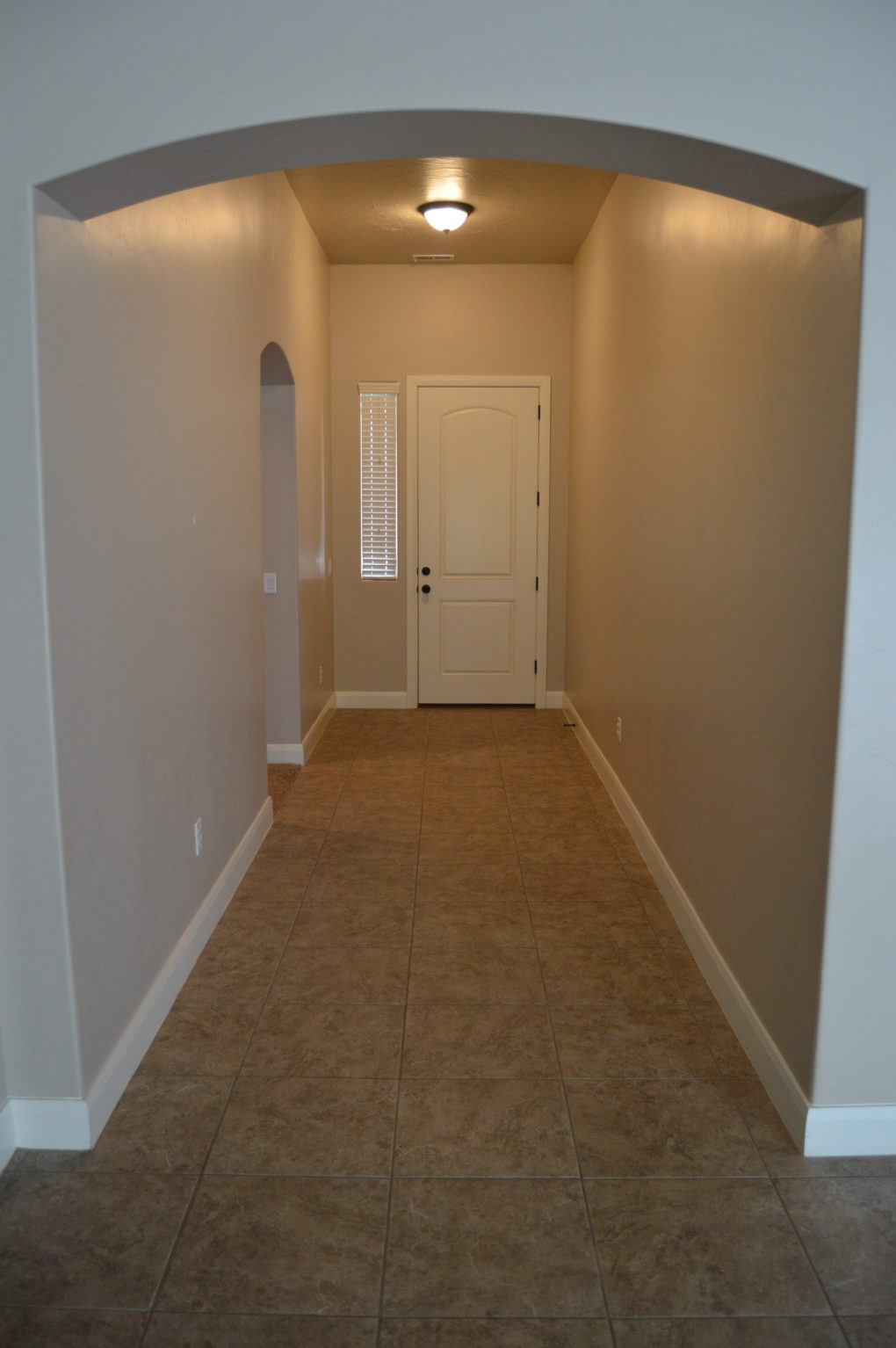
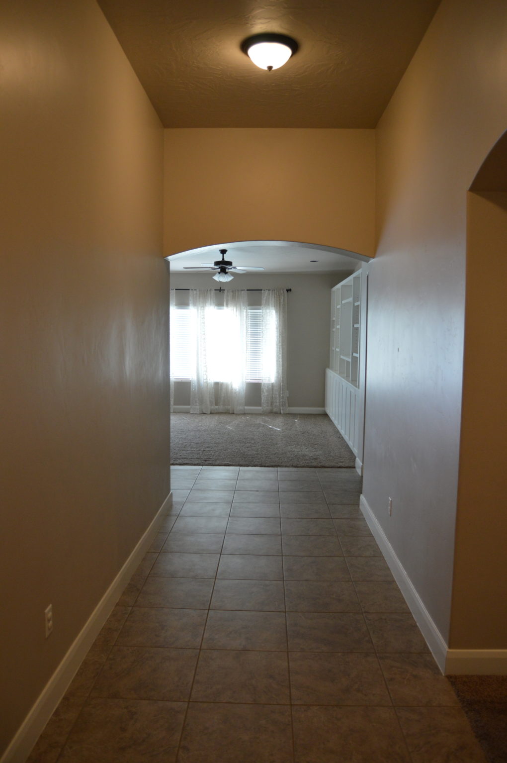
Here is what it looked like bare, right after we were handed the keys to move in.
One Year Later Pictures
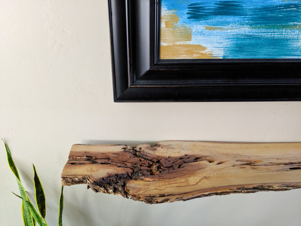
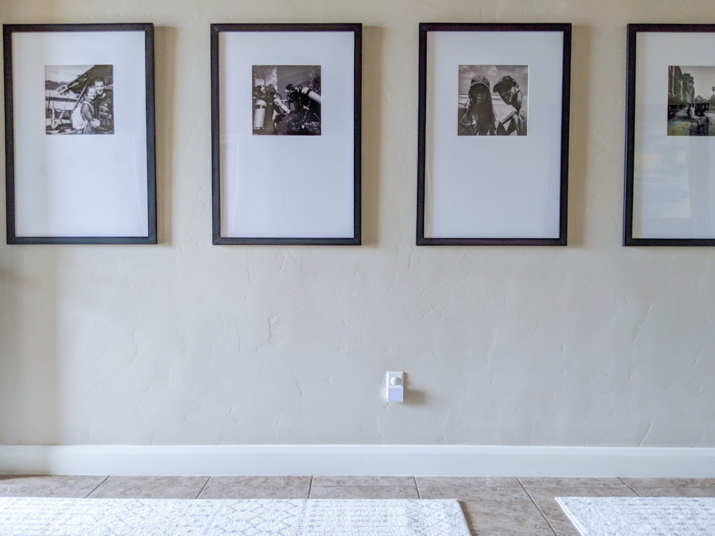
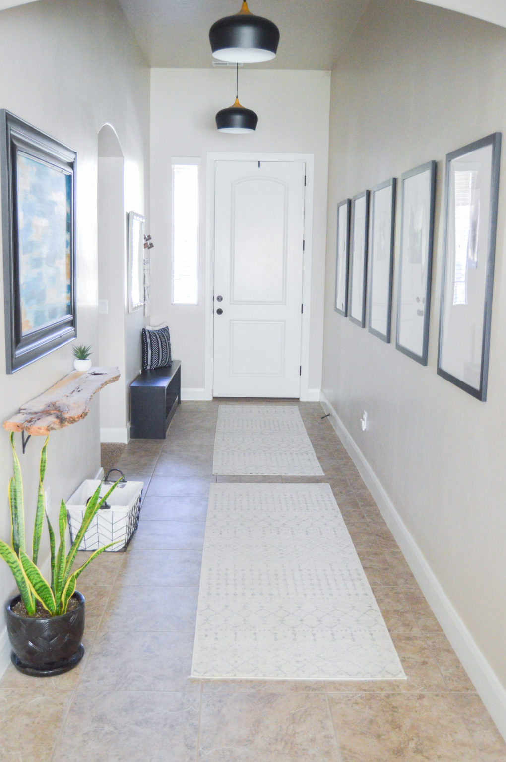
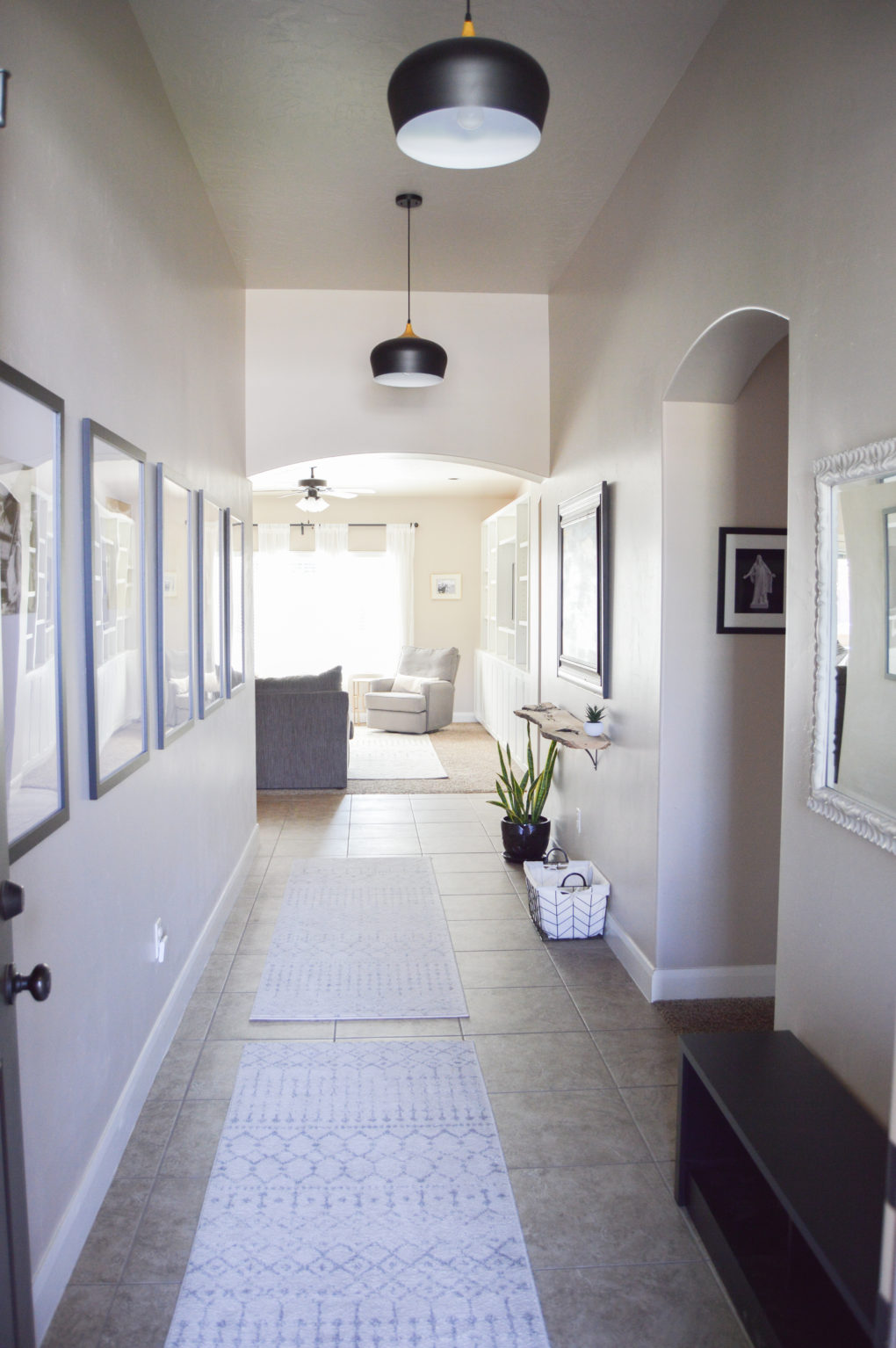
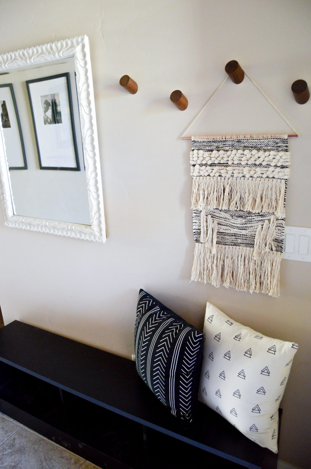
And here is what it looks like now, one year later! We changed the light fixtures, added an oversized travel gallery wall, hung a DIY wood slab shelf, and added some fun coat hooks and other decor. What we once considered a too-long-and-somehow-also-too-wide space is now such a personalized and well-loved space in our home. (Click here for more product links.)
The Kitchen
For Sale Pictures
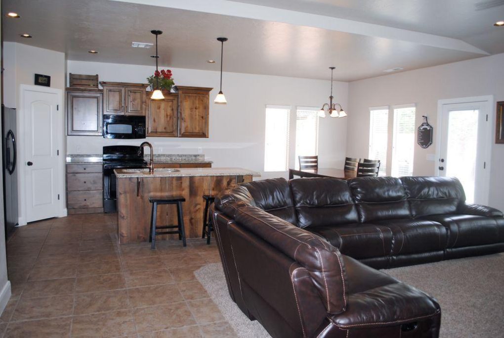
Here is what the kitchen looked like online when the house was for sale.
Before Pictures
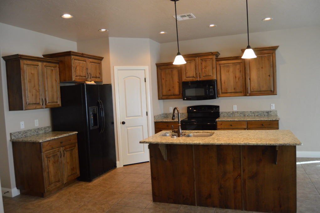
Here is what it looked like bare, right after we were handed the keys to move in.
One Year Later Pictures
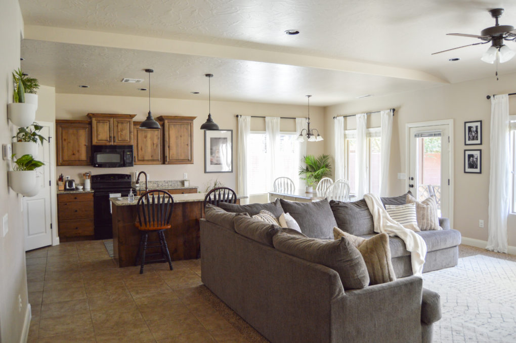
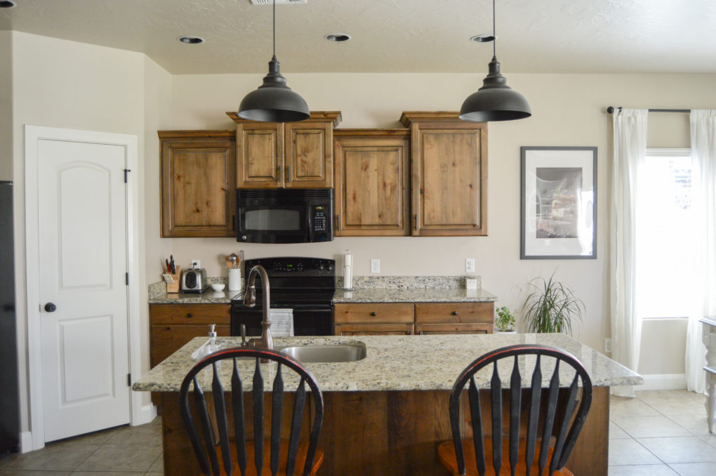
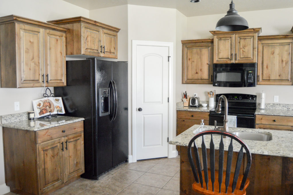
And here is what it looks like now, one year later! We changed out the pendant lights over the island, switched out the hardware (with these and these) to make it more modern, threw in some taller bar stools, and added our own small touches throughout.
Dining Room
For Sale Pictures
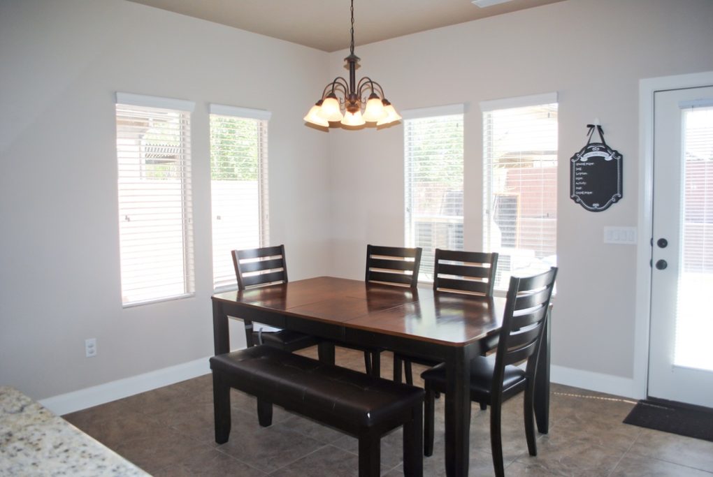
Here is what the dining room looked like online when the house was for sale.
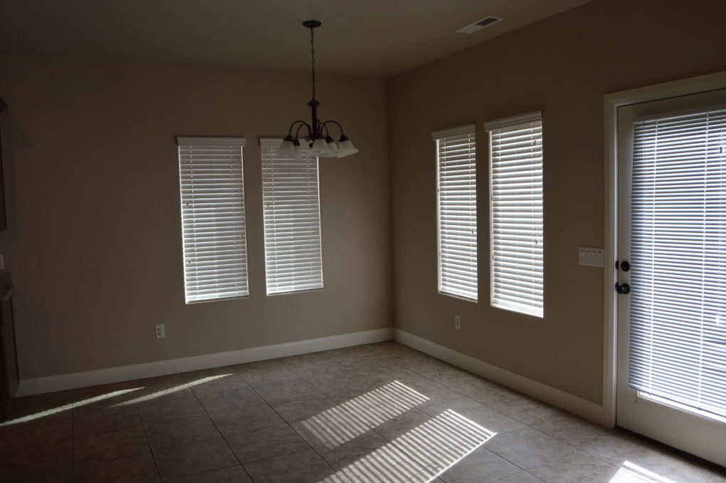
Before Pictures
Here is what it looked like bare, right after we were handed the keys to move in. Sorry for the dark image! I was in a hurry.
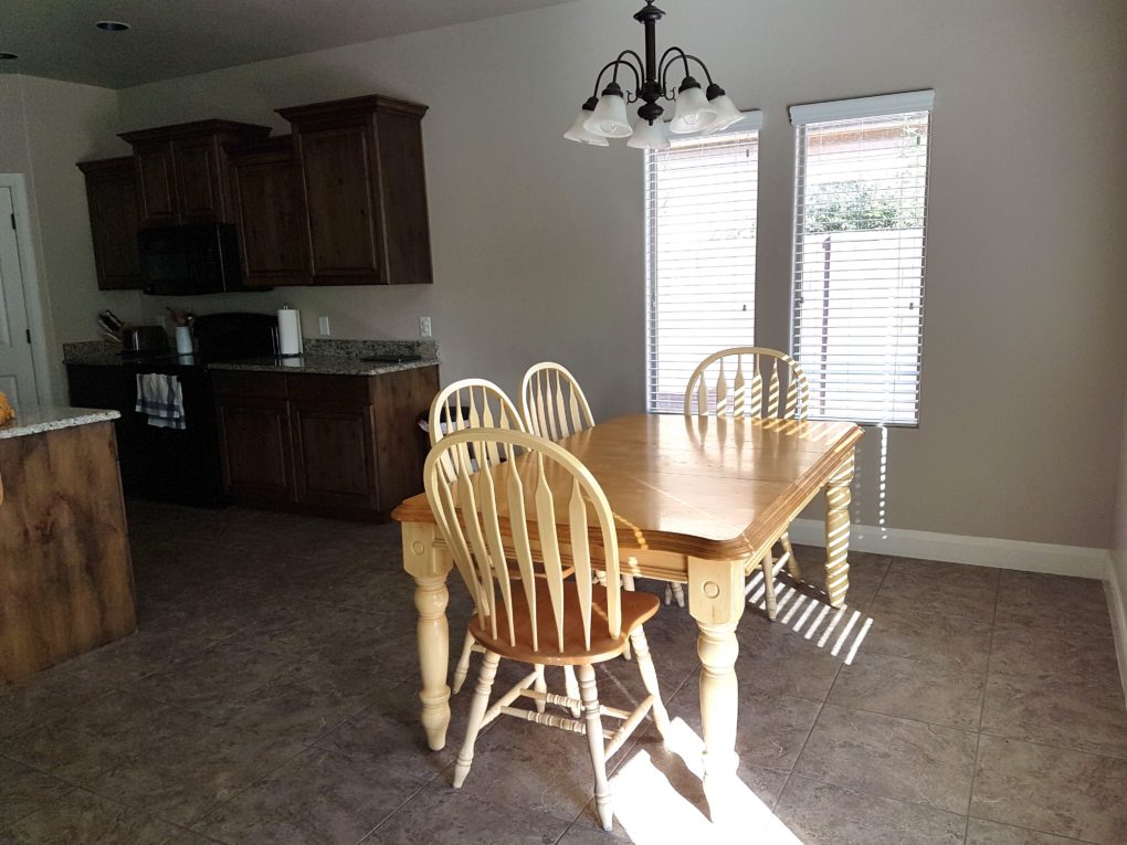
And I have to show you this before pic too from when our table just did not work in the space.
One Year Later Pictures
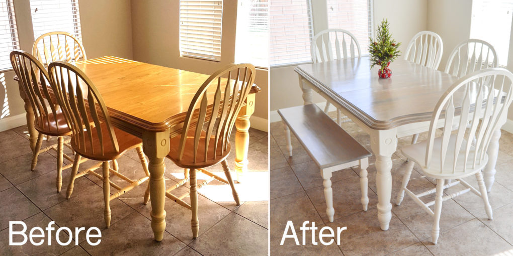
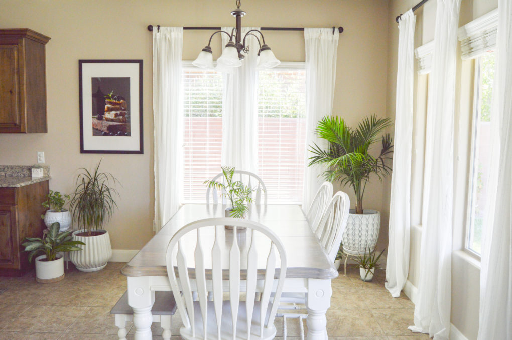
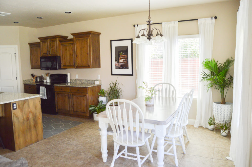
And here is what it looks like now, one year later! We put up curtains, added a bunch of plants, hung a fun/large food print, and simmered down our once-clashing yellow dining table and chairs (click here for our DIY grey wash tutorial).
The Living Room
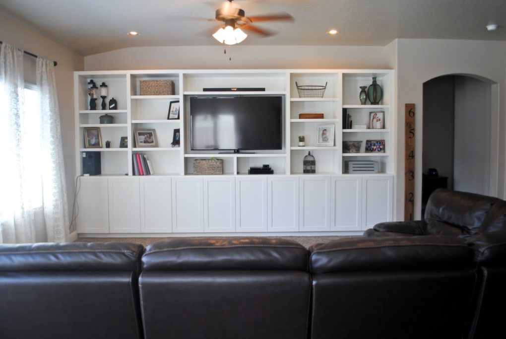
For Sale Picture
Here is what the living room looked like online when the house was for sale.
Before Pictures
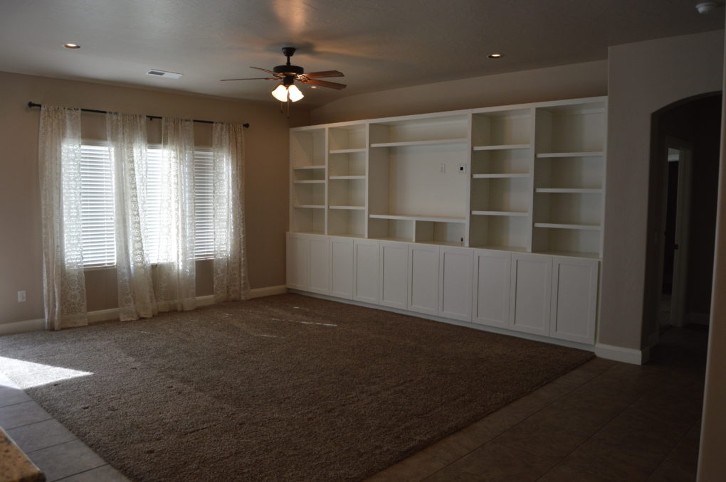
Here is what it looked like bare, right after we were handed the keys to move in.
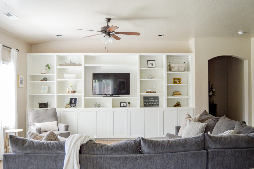
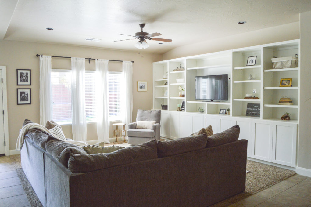
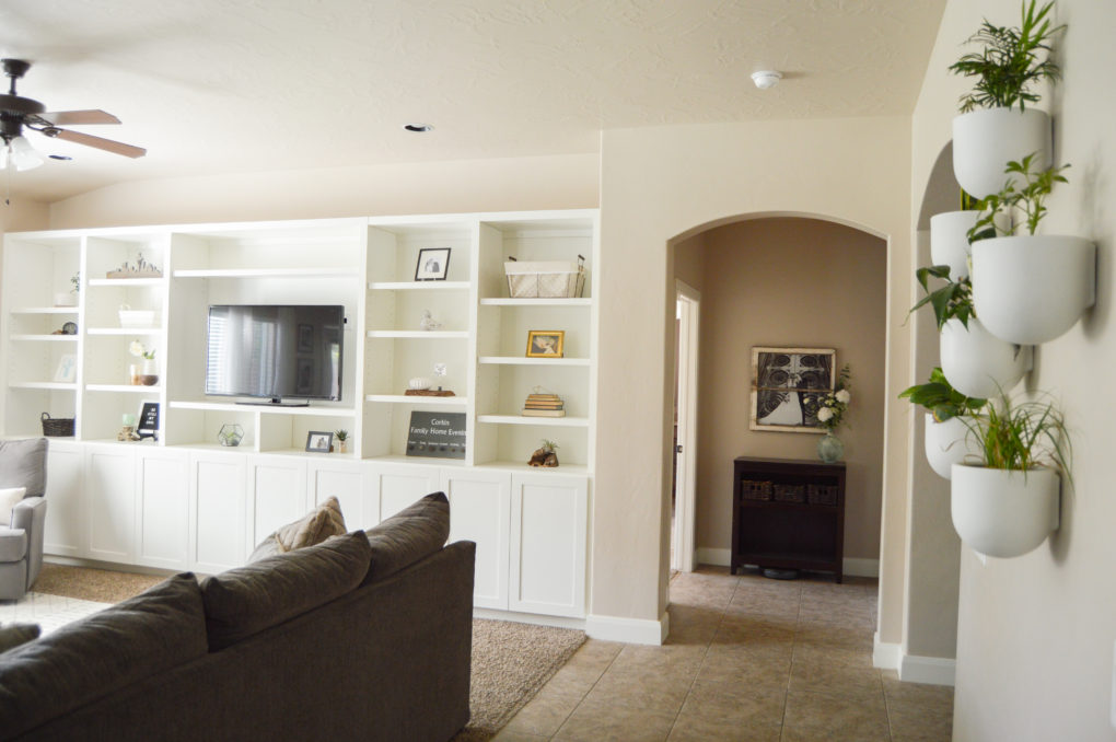
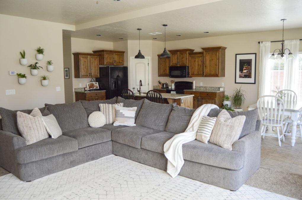
One Year Later Pictures
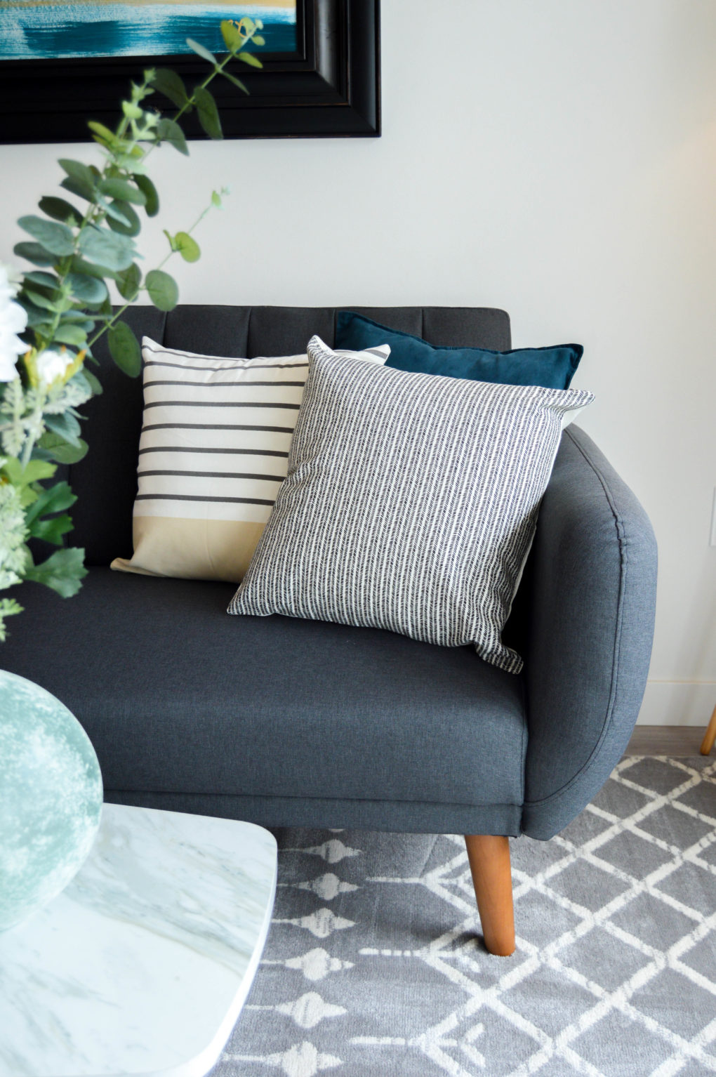
And here is what it looks like now, one year later! From the start we loved the white built-ins, so nothing has changed there. We do, however, love our cozy/sinkable couch. Our favorite changes: we added a rug to lighten up the floor, switched out the curtains for white and breezy ones, and hung a super cool plant wall feature.
The Master Bedroom
For Sale Picture
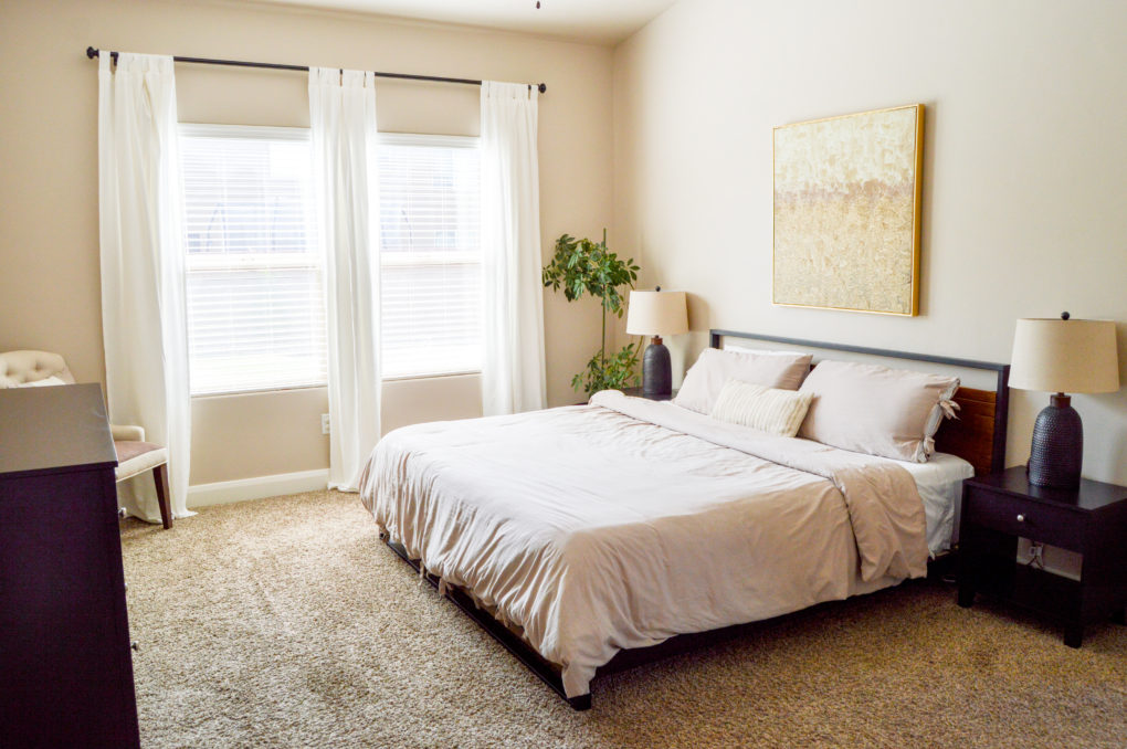
Here is what the master bedroom looked like online when the house was for sale.
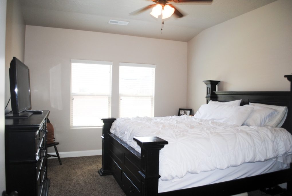
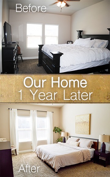
Before Pictures
Here is what it looked like bare, right after we were handed the keys to move in. Sorry for the dark pic! I was in a hurry.
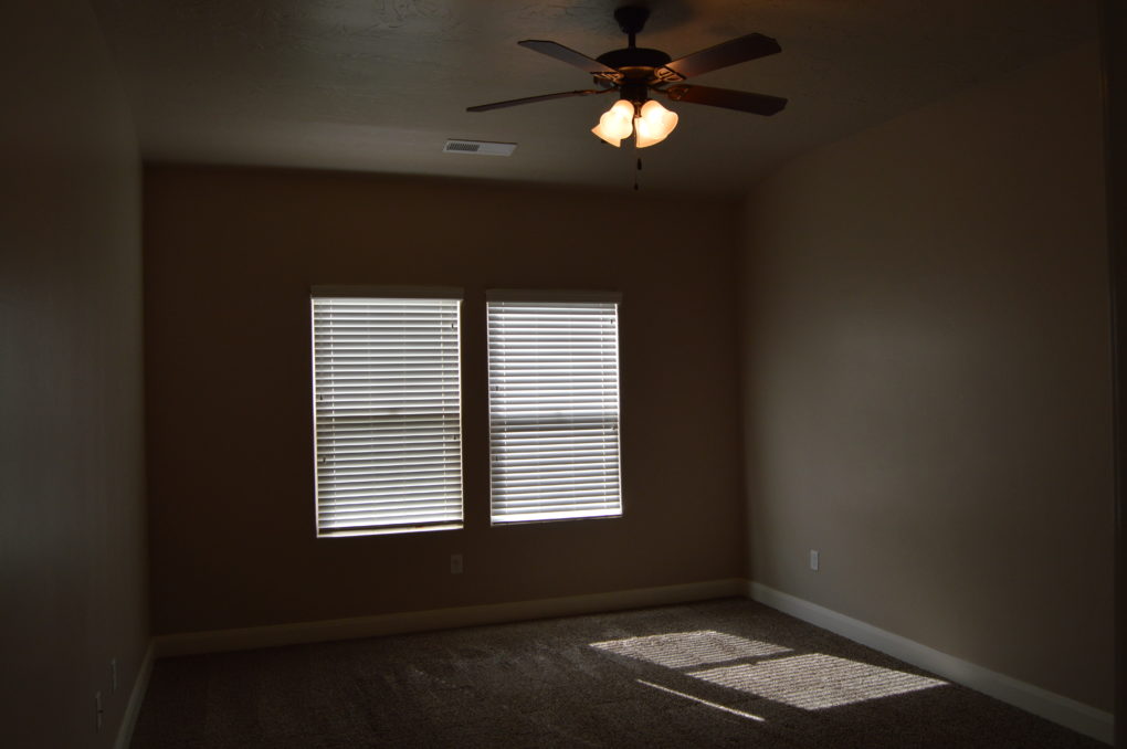
One Year Later Pictures
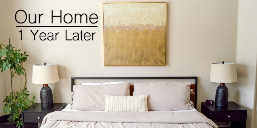
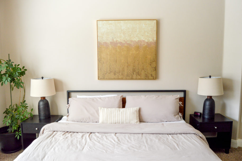
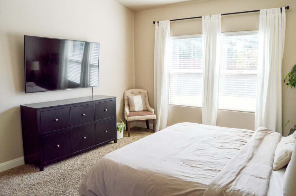
And here is what it looks like now, one year later! Going for a casual but classy feel, we went with a low-set modern bed and frame (with this duvet cover), hung white curtains, and added wood and gold touches. We love the contrast between the light and dark colors in this room. It definitely feels cozy and simultaneously hotel-like, which is fun.
The Playroom
Before Pictures
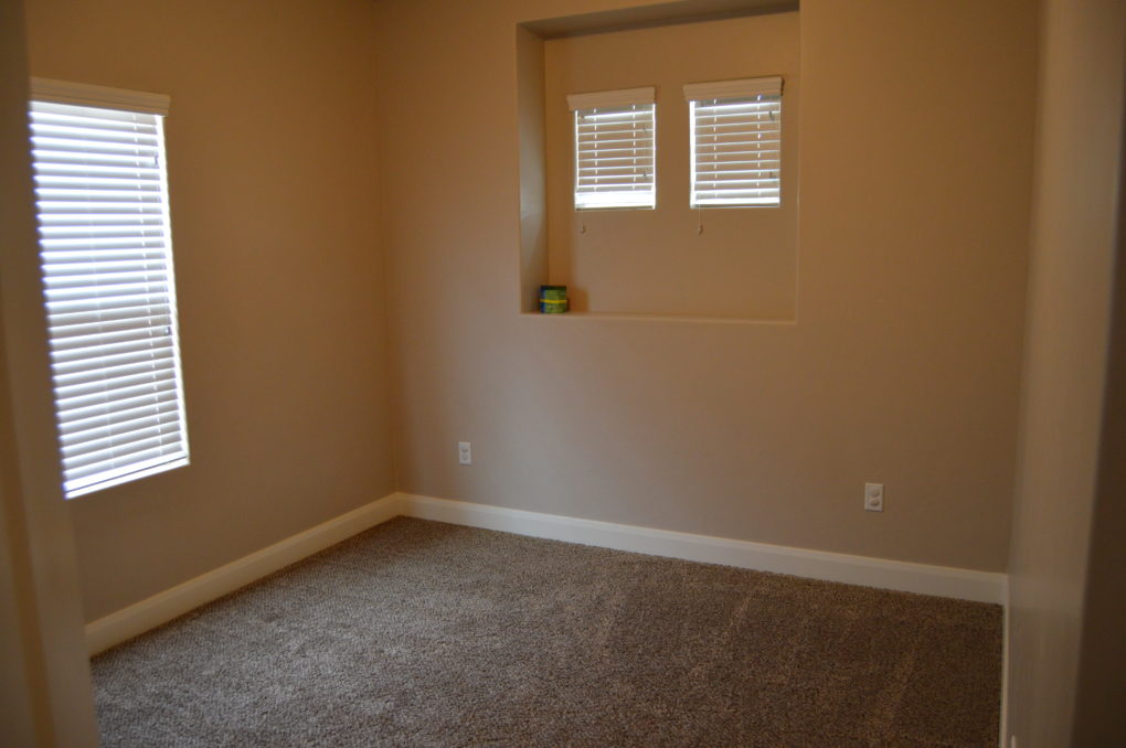
There were not any pictures online during the sale to compare ours to. But, here is what the playroom looked like bare, right after we were handed the keys to move in.
One Year Later Pictures
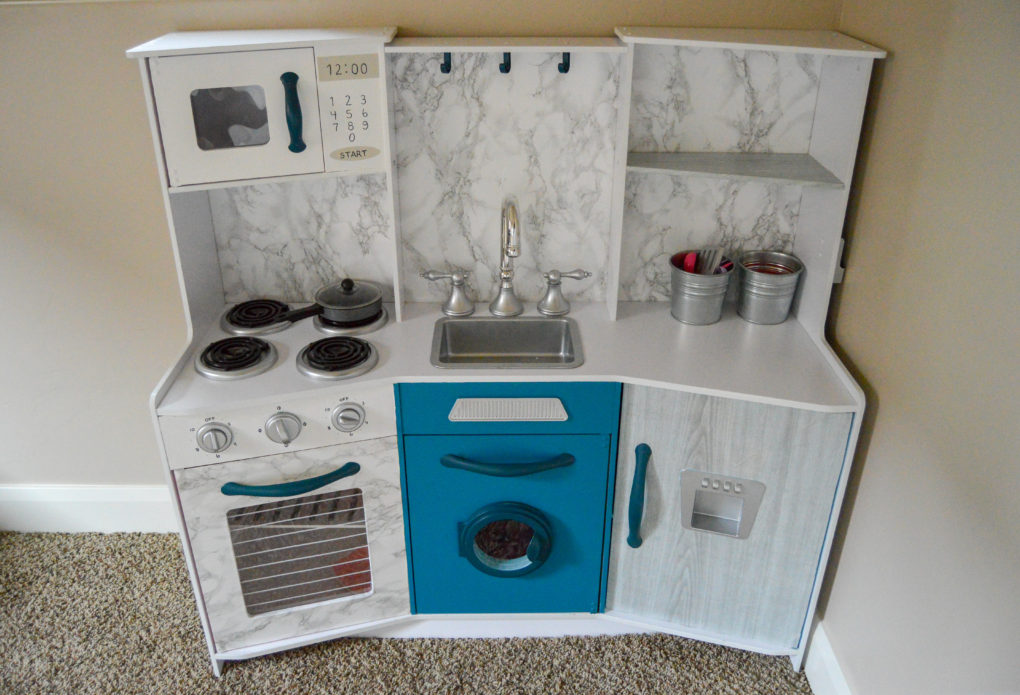
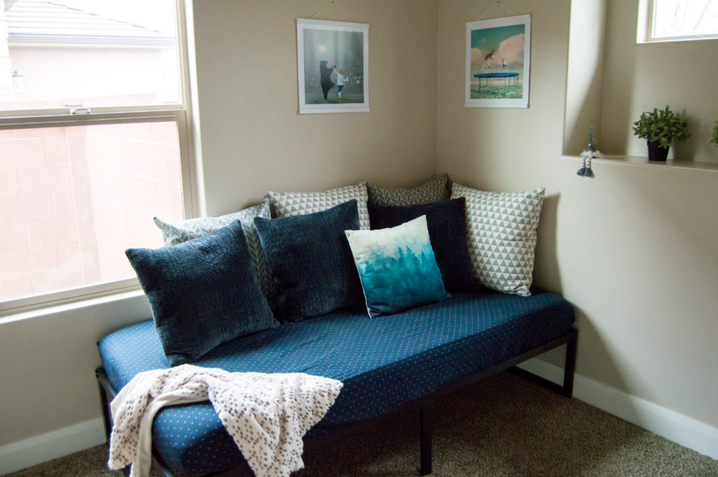
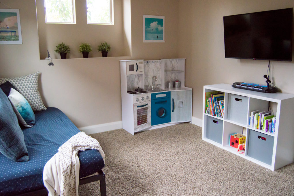
And here is what it looks like now, one year later! Not a lot of DIY happened in this room, other than updating the play kitchen from a pastel pink to this classy thing that jives with the rest of the room. Because this space doubles as our guest room, we went with a daybed vibe by throwing a bunch of pillows on the low-profile bed so it can serve as a functional couch when the kids play/watch shows. We also love the whimsical art prints (that come from one of our favorite baby books) on magnetic wood frames. (Click here for links to products in this room.)
The Kids’ Bedroom
Before Pictures
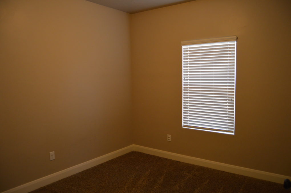
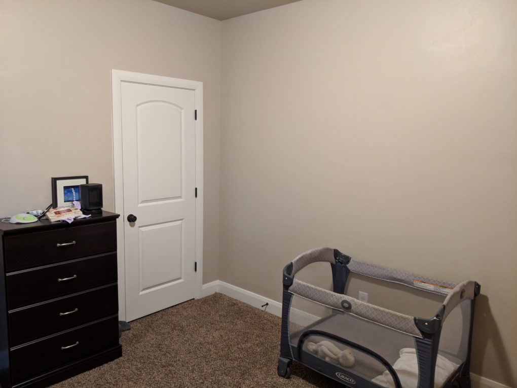
There were no pictures of this room online when the house was for sale, but here is a picture of it bare when we first got handed the house keys.
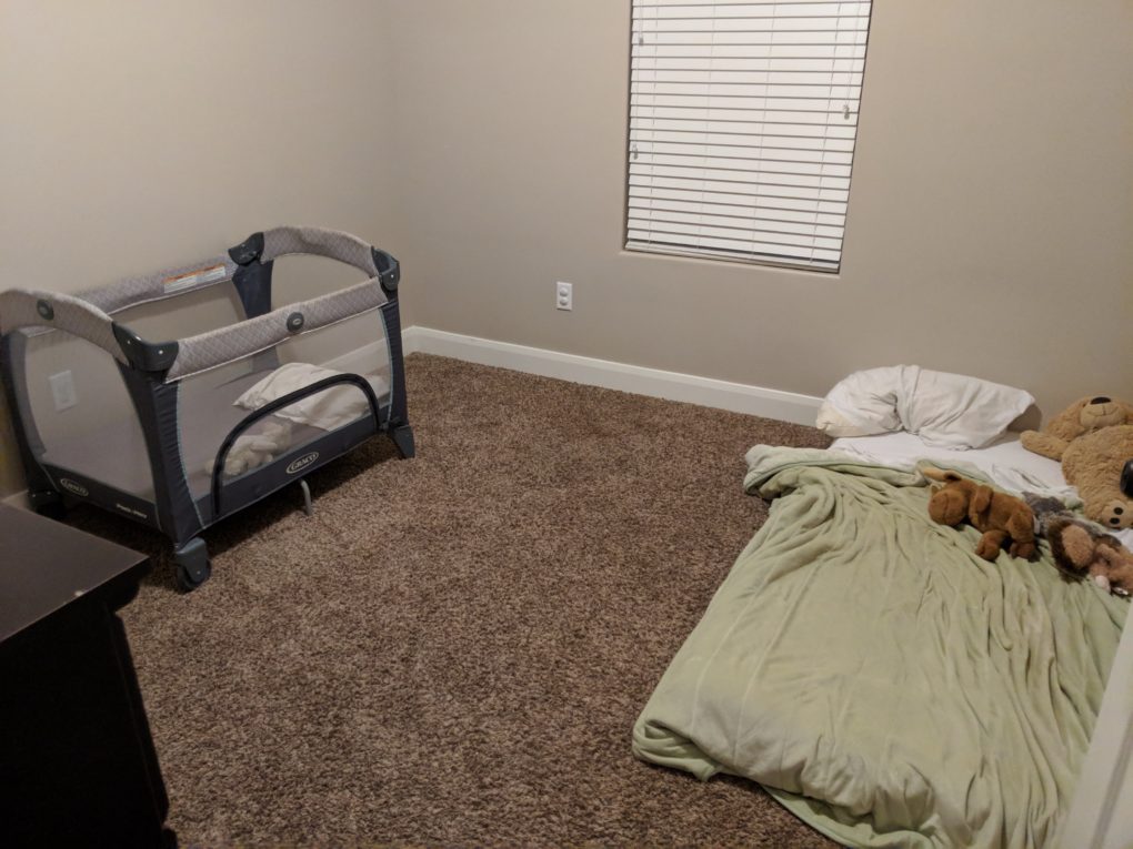
And this is what their room looked like for months! The other rooms in the home needed more of our immediate attention, so it took us a while to get around to doing anything fun in here.
One Year Later Pictures
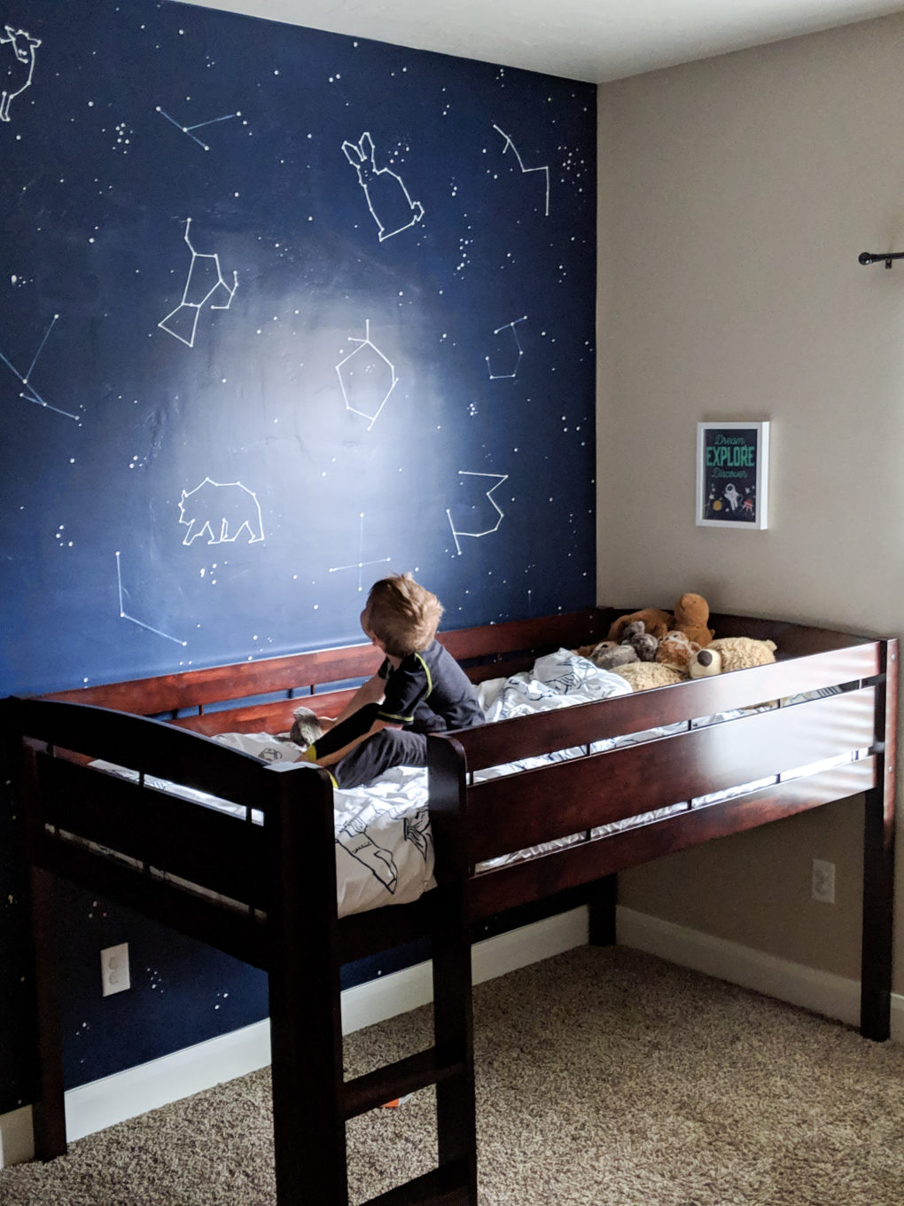
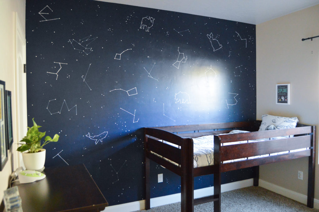
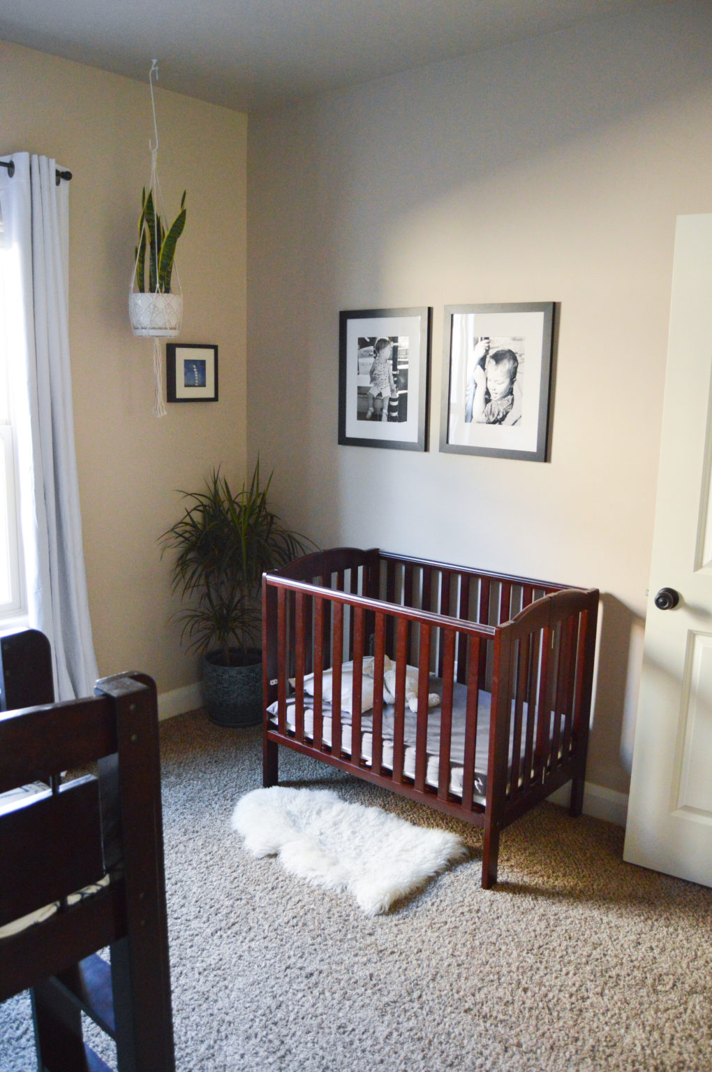
And here is what it looks like now, one year later! The biggest change in the room was the focal-point constellation wall that I painted to go with the space theme my son picked out. His low-loft bed (with a rocket-ship bedspread) often gets turned into a fort. My daughter’s side of the room has a counting-sheep theme that gels well with the rest of the room’s space/star theme. We added plants, art, and curtains to make this room more cozy and personalized. (Click here for more product links.)
The Office
For Sale Pictures
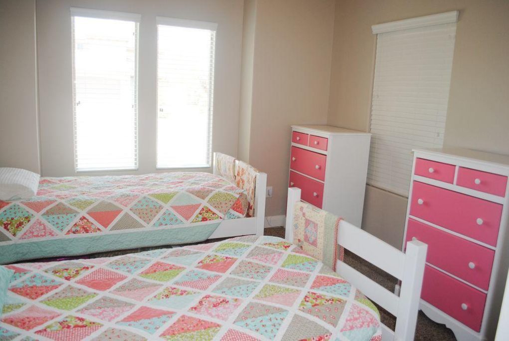
Here is what the office looked like online when the house was for sale. Of course, they didn’t use it as an office but as a kids bedroom.
Before Pictures
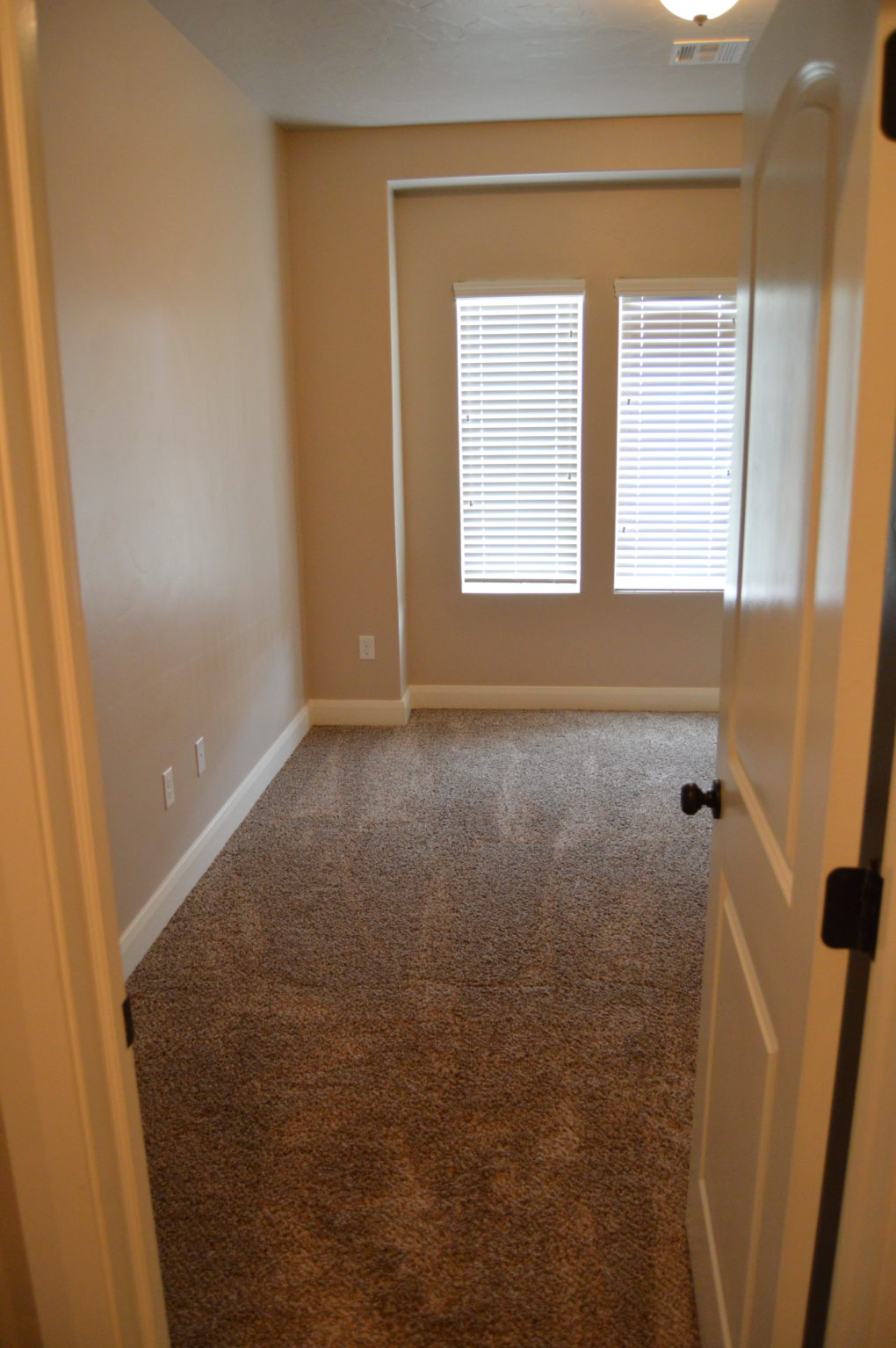
Here is what it looked like bare, right after we were handed the keys to move in.
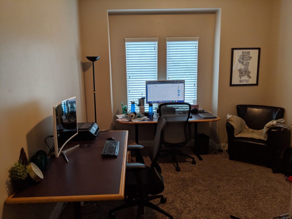
And I can’t not show you this picture of what it looked like months after we moved in. We were using borrowed desks and furniture for a while!
One Year Later Pictures
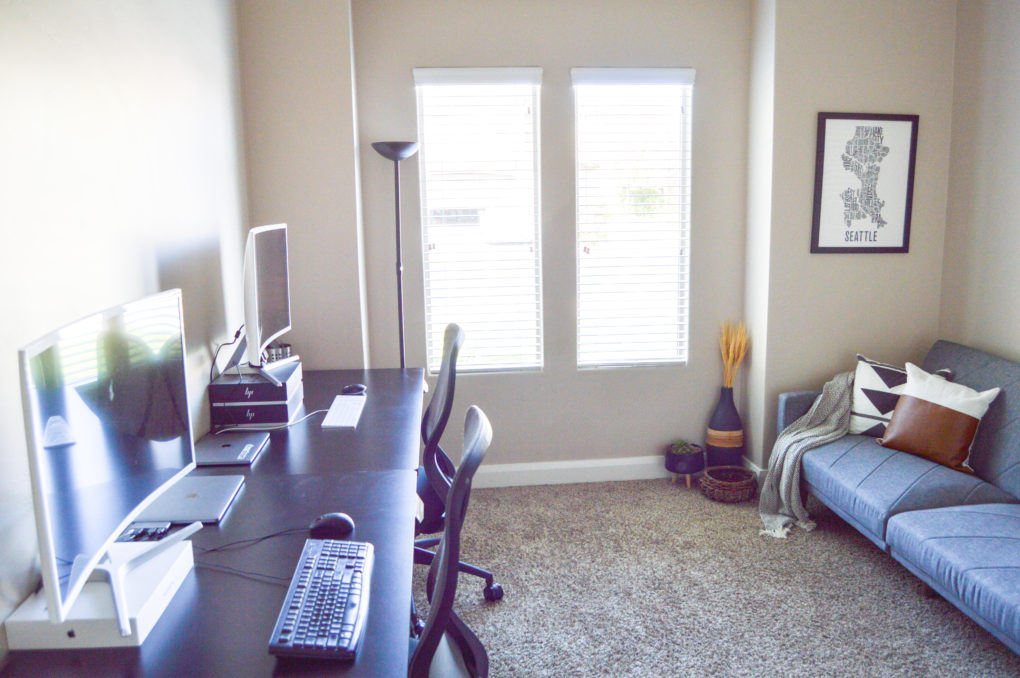
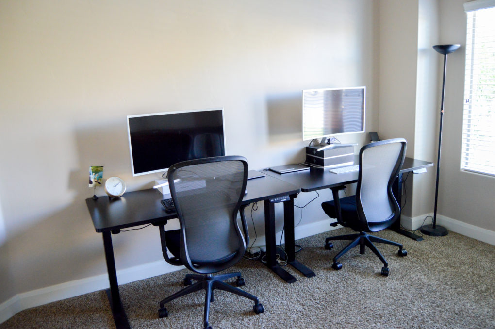
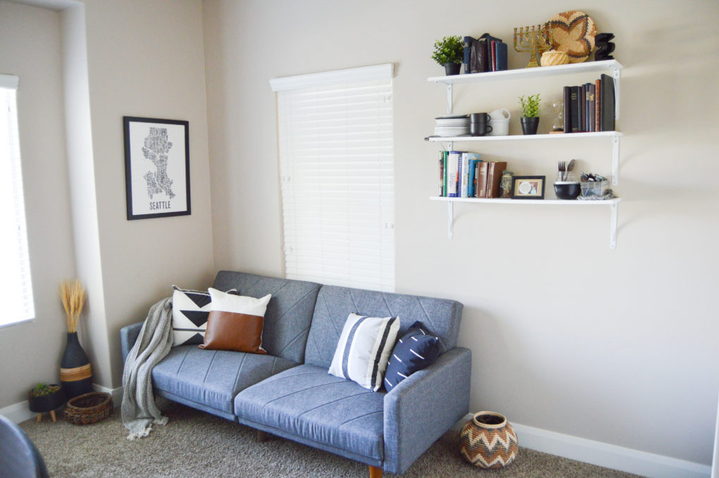
Here is what it looks like now, one year later! Goodbye heavy, maroon desks and hello sleek, modern desks. You can’t even tell from the picture, but they are standing desks which we definitely utilize. And we got matching computer monitors that are huge and awesome because we like twinning.
We hung floating shelves so the kids can’t reach our stuff, put in a couch with a throw blanket and fun pillows, and added other touches that make this much-used space feel nice. Because Jake spends a lot of his day in here, we wanted the room to feel masculine. I love how it looks so far.
The Backyard
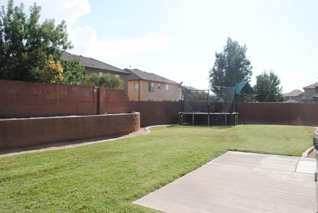
For Sale Pictures
Here is what the backyard looked like online when the house was for sale.
Before Pictures
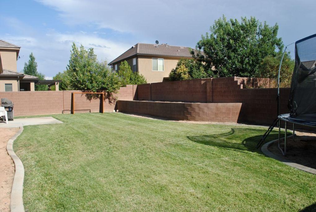
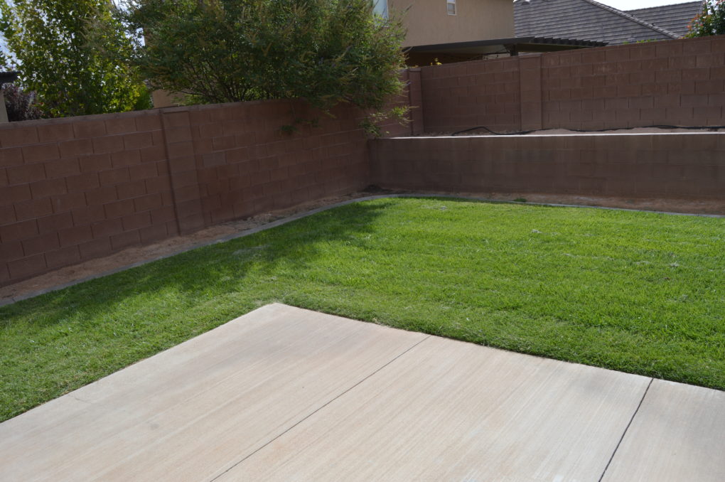
Here is what it looked like bare, right after we were handed the keys to move in.
One Year Later Pictures
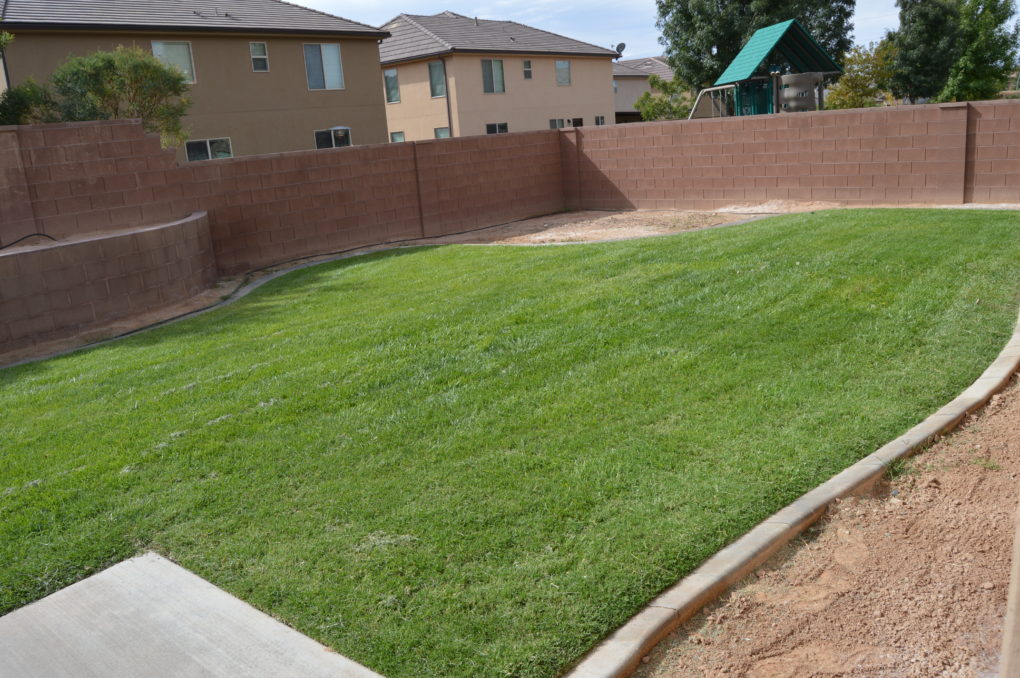
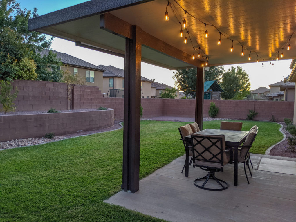
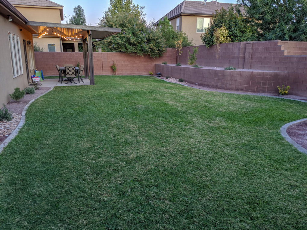
And here is what it looks like now, one year later! The two biggest (and most expensive) changes we made back here were: adding an awning over the patio and filling in the dirt landscape with plants and rocks. Other than also hanging up string lights and assembling an outdoor dining set, we didn’t do much else to make this yard feel totally more homey.
Looking Ahead
I love the changes we made and will definitely pause to admire and celebrate them. That said, we have big dreams for next year! I’m not giving any spoiler alerts, so you’ll have to stay tuned to see what’s up next 😉
Pin it for Later
